Presentation of your own performance
Dear Sir or Madam,
The dashboard shows which provider is or was currently active. However, if you trade via a connected broker yourself, this is also displayed on the dashboard but unfortunately not in the chart.
It would be nice if you could not only see the performance of the providers in the chart, but also your own performance, both positive and negative. Maybe even with different colors. At the moment blue and orange are for the providers and then other colors for negative and positive,
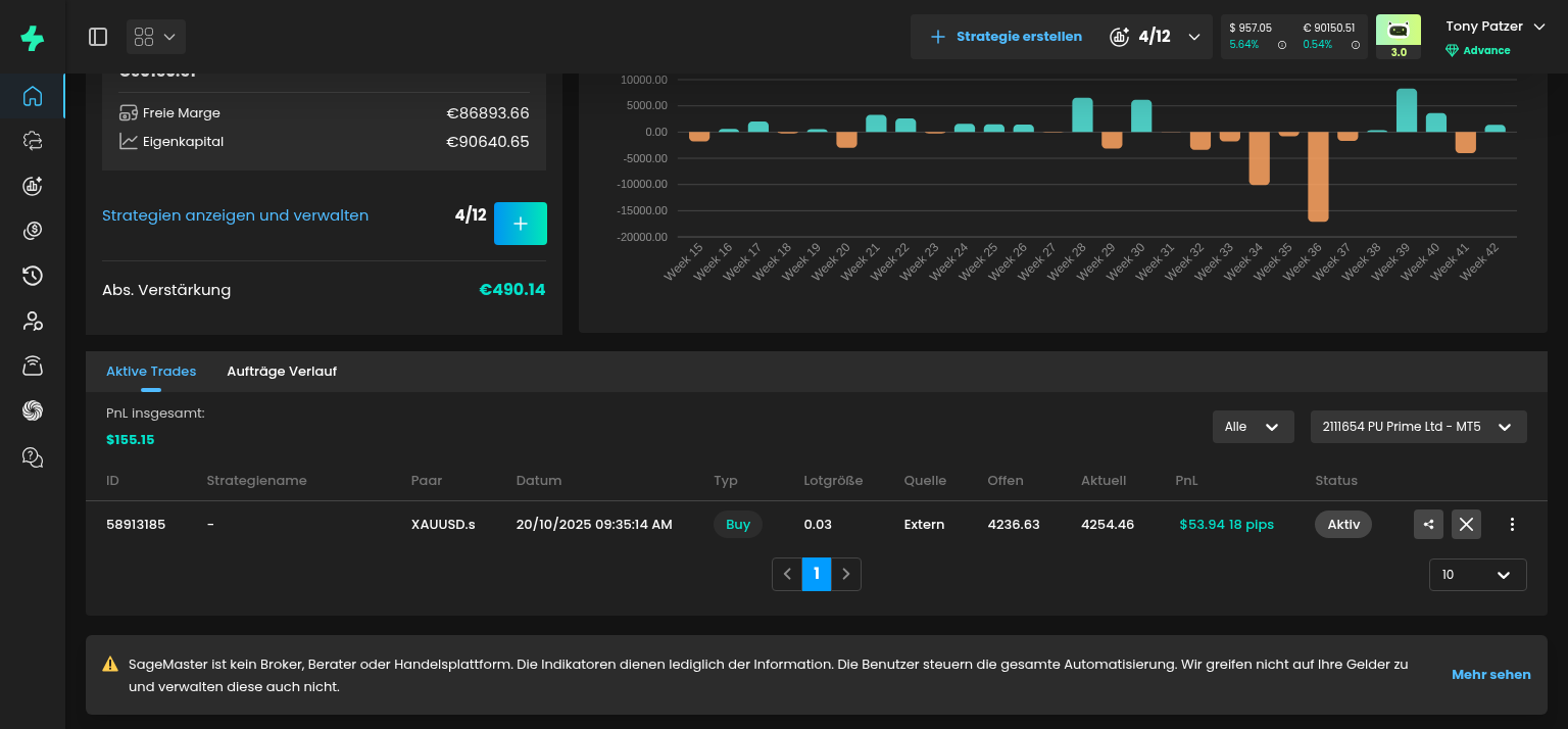
for your own performance.
For example, if I have a longer negative period and the providers are positive for longer at the same time. Then I only see the very good performance of the providers in Sagemaster but not my negative performance.
So everything looks good in Sagemaster but the opposite in my broker account.
It would be nice if you could find a way to do this. To include your own performance in the chart.
Kind regards
Tony Patzer
Please authenticate to join the conversation.
Added to Backlog
Feature Request
7 months ago

Tony Patzer
Subscribe to post
Get notified by email when there are changes.
Added to Backlog
Feature Request
7 months ago
Tony Patzer
Subscribe to post
Get notified by email when there are changes.